Quishing - Just Another Way For People To Click Your Link
You’ve read about phishing. You’ve heard about vishing. You’ve glanced over smishing. Now get ready to scan quishing.
All of the -ishing variants aim to trick the user into doing something that is not in their interest. Commonly, this would be used to ask the user to provide their credentials (log in), enter payment details (credit card number), provide information they would normally safeguard, or just to get the user to interact with a possibly dangerous internet server.
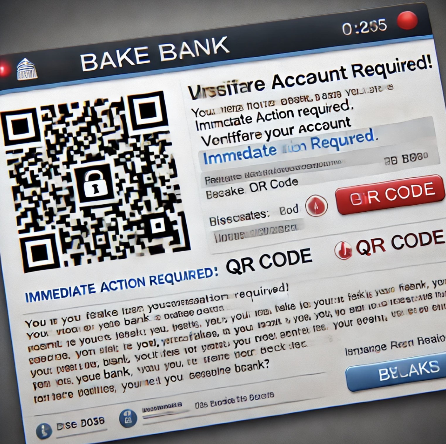
Quishing is just the latest buzzword for phishing with QR codes. This (fairly on-point) AI image shows what an attack could look like:

I’m sure the blue teamers and sysadmins among us could do a better job than me explaining why having QR codes in email can be an excellent approach for bypassing link filters. Having a strange link in your email could get the attack blocked, but having the link inside an image in the form of a QR code might just work. Though I’m sure the filters will catch up over time.
From my perspective QR codes are fantastic, because mobile phones are focused on “user experience” and not “being able to verify and double check things”. Scanning QR codes is incredibly easy (remember when you needed a separate app for it?), and the default is often to open the link instead of inspecting the link. You scan the QR code, you end up at a Microsoft login page, and then you enter your username and password. You approve the login using Microsoft Authenticator. BAM – phished.
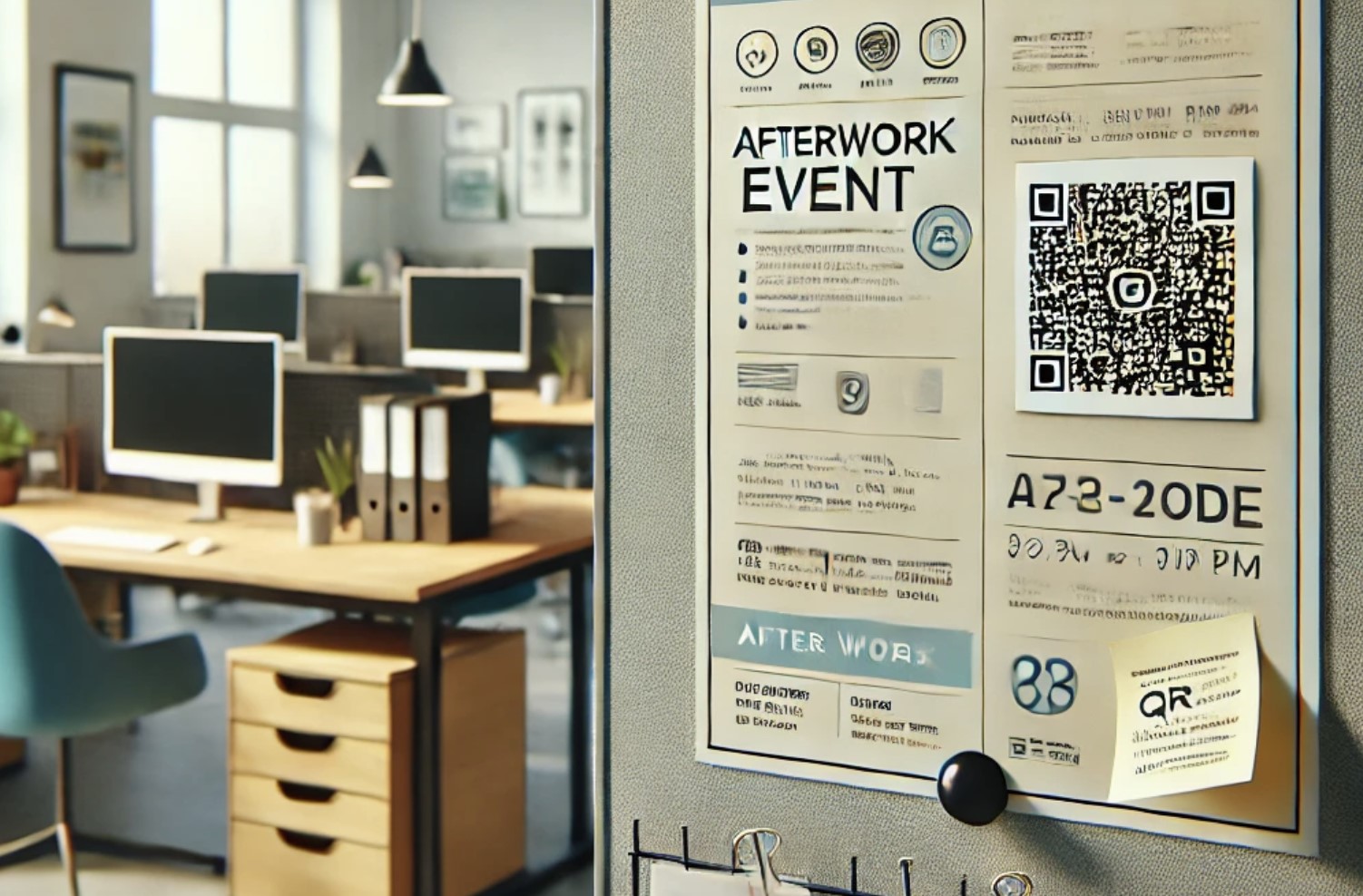
People are not used to verifying links on their phone, and the ways of doing so are clunky and non-intuitive. Scanning something on-screen in an email might make some people think twice, but I’m willing to bet that most people will not double-check if they’re scanning a printed QR code. All it takes is for someone to glue a different QR code on top.

I don’t think that Quishing is any different from any of the other ways to phish people; it all boils down to tricking people. It is just the latest buzzword making the rounds at the moment. If anything, it highlights the need for better UI design to empower users to make more informed decisions.
I’ll leave you with a few quick tips,
- When was the last time you reviewed a full URL on your phone? Learn how to copy the link from a QR code instead of navigating to it immediately. Paste it somewhere (that won’t generate a preview) and then review the link as you would for an email.
- Email the link to yourself if it’s troublesome for you to double-check the link on your phone. And if nothing else, the security filters and tooling will have one more chance at inspecting the actual link.
- Consider using software on your laptop to read QR codes that are displayed on your screen. Won’t help you when you’re out and about, of course.